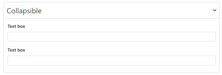
Similar to the group panel but it can be collapsed
Main Settings
Is collapsed by default: Define if the field is collapsed or not by default
Style: Select an style of the collapsible field (with or without borders)

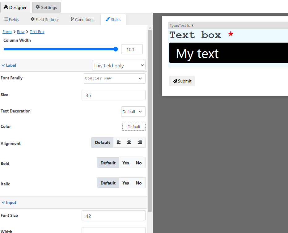
Styling options
With the style designer, you can change stuff like the border background color font, etc
Condition Options
With the conditions builder, you can set up 3 types of dynamic conditions (which are conditions that are triggered when a condition is met):
- Show hide: to hide or show the field
- Custom validation: to make the value of the field valid or invalid