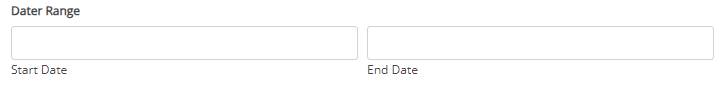
A field with two date pickers where the user can select a start and end date
Main Settings
Placeholder: A placeholder for the empty start and end date
Default date: Default start and end date
Add time picker: Add a time picker to the date range
Format: Format of the date and time
First day of the week: Define what is the first day of the week that is going to be shown in the calendar
Disable day of the week: Define what are the selectable days of the week
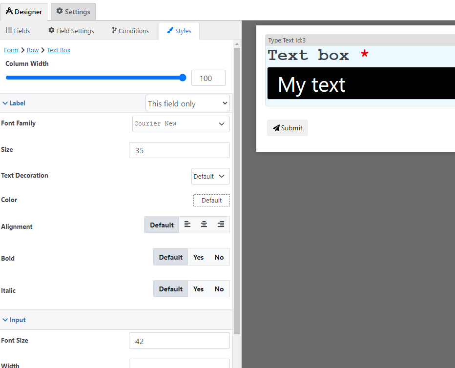
Styling options
With the style designer, you can change stuff like the border background color font, etc
Condition Options
With the conditions builder, you can set up 3 types of dynamic conditions (which are conditions that are triggered when a condition is met):
- Show hide: to hide or show the field
- Required: To make the field required
- Custom validation: to make the value of the field valid or invalid
Pricing calculation options
You can use this field to calculate a price with the following options, for more information about price calculation check the price calculation tutorial
- Fixed Amount: Set a fixed price that is used when this field is filled
- Price per day: Define a day for each day in the date range
- Formula: Use a custom calculation to define this field price