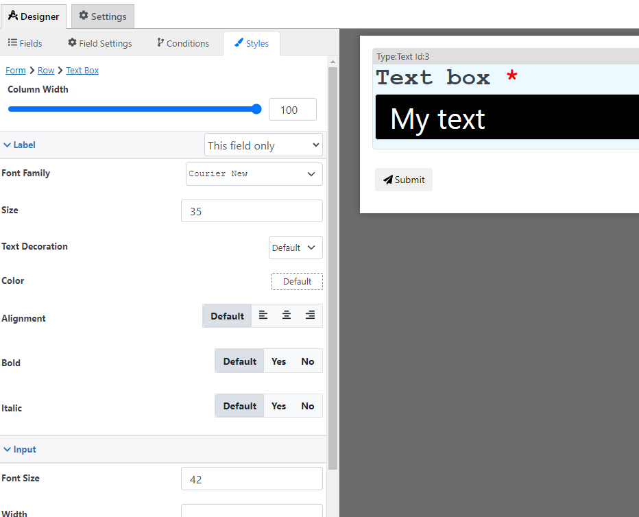
The text box field is just a basic box where the user can input text

Main Settings
Icon: Custom icon or image that is shown at the beginning of the box

Placeholder: A text that is shown when the field is not filled

Default Text: The text that is displayed by default when the form is loaded
Styling options
With the style designer, you can change stuff like the border background color font, etc

Condition Options
With the conditions builder, you can set up 3 types of dynamic conditions (which are conditions that are triggered when a condition is met):
- Show hide: to hide or show the field
- Required: To make the field required
- Custom validation: to make the value of the field valid or invalid
Settings Calculations Support
You can include calculations in the following setting(s), for more information about calculations please check the formula settings tutorial:
- Default Value
- Price
Pricing calculation options
You can use this field to calculate a price with the following options, for more information about price calculation check the price calculation tutorial
- Fixed Amount: Set a fixed price that is used when this field is filled
- Current Value: The value filled in this field is used as the field price (if a not numeric field is used the field price will be 0)
- Quantity: This field is going to be used to specify the quantity of the form (the price of the form is multiplied by the quantity of the form to calculate the final total)
- Formula: Use a custom calculation to define this field price